Question 2
How effective is the combination of your main product and ancillary texts?
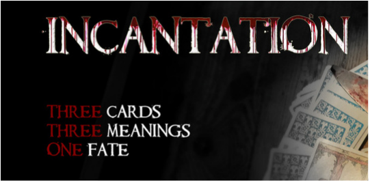
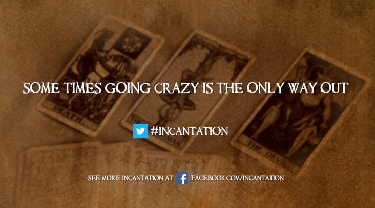
Our trailer, magazine and poster all have a similar theme with the same font for the title and the tarot cards being repeated in the trailer, magazine and poster.
Consistent font
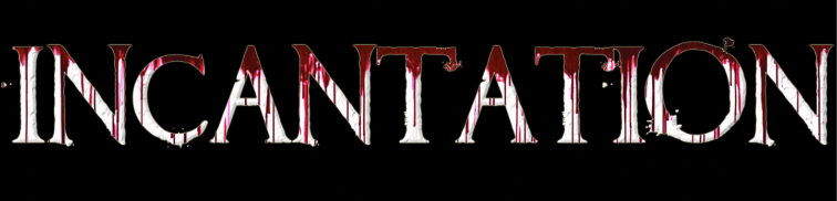
We used Requiem font style throughout the trailer and we found that this font was link with our trailer that is why we have included it in our magazine and poster as well. another reason we use the same font is to be consistent throughout the project. if we used a different font on the magazine and poster and trailer we feel as a group it wouldn't of worked because it would look different.
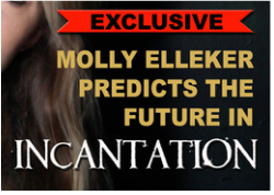
Magazine Font
Poster Font
Trailer Font
|
|
Repeated Icons
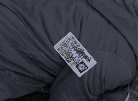
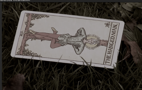
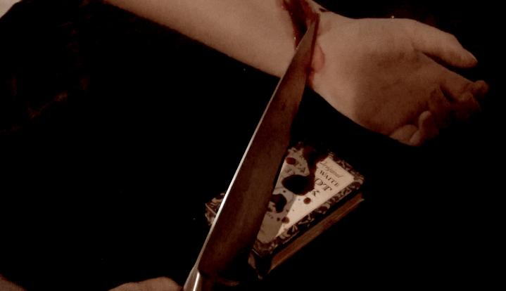
Throughout our trailer we have repeated the image of tarot cards we believe this is our repeated icon. The majority of horrors use a weapon or something people are afraid of as their main repeated icon, whereas we decided that we wanted the tarot cards to br ours as it is the main reason why unusual things are happening and it will be remembered by the audience as the tarot cards are uncommon and a bit creepy.
|
|
|
|
Dan and Molly
