Magazine Cover vs Movie Poster Analysis
|
Magazine Cover
|
Vs
|
Movie Poster
|
|
|
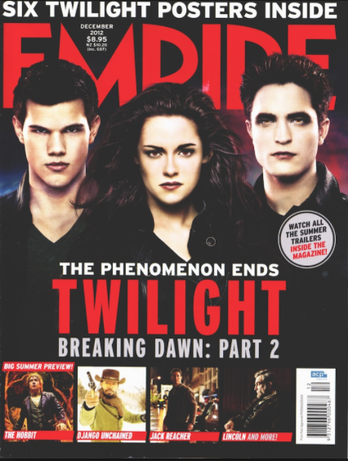
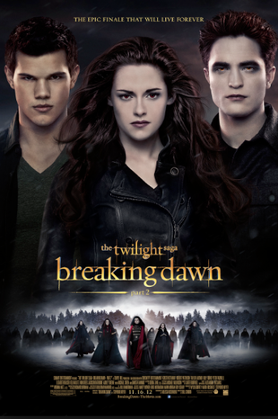
This is the magazine cover and movie poster for Breaking Dawn Part 2, it is clear to see the similarities in these as the picture is the same in both forms of media, the colour scheme is also similar as the background is black and the rest of the colours stand out from the background. There are also many differences between the two, the poster has more text on it, like the usual movie poster, it also has an extra picture showing off some more of the cast. Whereas the magazine cover has more pictures on it showing what is inside the magazine, there is also minimal text, this is so that the reader's main focus is on The Twilight story. The title of the magazine cover is covered by the heads of the characters, this shows us that the characters are important and that they stand out during the film, once again, it also draws in the reader and makes them instantly see the main story rather than the other, less important columns.
|
|
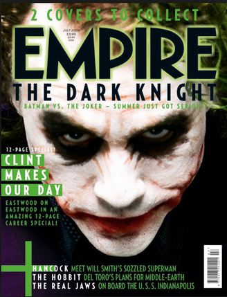
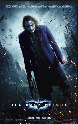
This is the magazine cover and movie poster for The Dark Knight, as you can see, both types of media include a picture of The Joker, this signifies his importance in the film and makes him one of the main characters, even though this is a Batman film. The magazine cover has a close up of The Joker's face, this shows off his dark eyes and cut up mouth which is not as easily seen in the movie poster where he is stood in an aggressive manor with a weapon in his hand. Both types of media show The Joker smiling in a way that comes across as quite scary. The colour scheme is similar using the dark colours as the background, this soon changes with the green and blue which are used separately by the magazine cover and the movie poster. The title of the magazine cover it lined with a bright green like the rest of the text on the magazine, this emphasises the other areas of text and the name of the magazine, making it stand out.
|
|
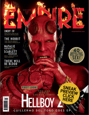
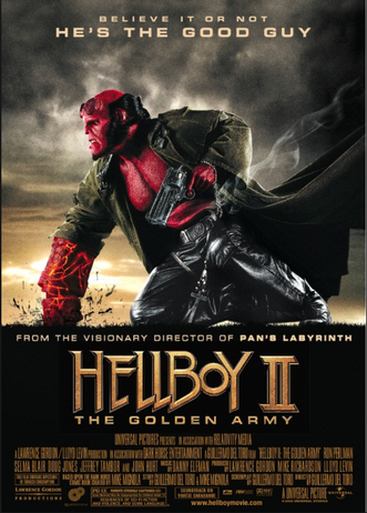
This is the magazine cover and movie poster for Hellboy 2. The main character of the film is once again shown in both the magazine cover and the movie poster, they are also portrayed in different angled shots like before. The magazine cover shows a close up of the character who looks weird compared to normal people, he looks half human and half 'something else.' This is not shown as obviously in the movie poster which shows a full body shot, the man does not look human at all and he just looks like a monster. The title of the magazine has been lit up in flames, this signals something to do with the red man in the middle of the page, entrapping the audience and making them want to now more. The colour scheme on both types of media seem to be rather different, the magazine cover is simple, black and red with the additional text and other icons, this makes the character stand out more, whereas the movie poster is lit up in the background with the colours of the sky, then there is aback chunk where the text goes, this has a golden colour text to go wight he title of the film, this makes the title stand out more than the character.
|
|
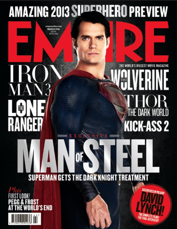
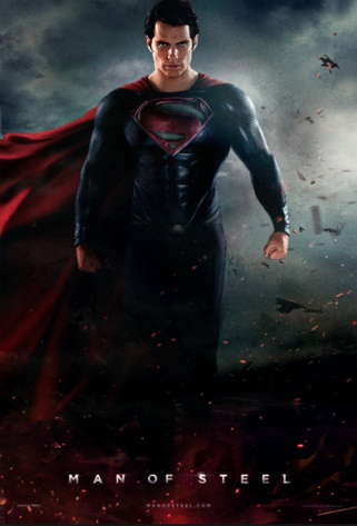
This is the magazine cover and movie poster for the film Man Of Steel, both the magazine cover and the movie poster are similar as they both portray the character in a similar 'action-shot' light. The colour scheme is similar with a lot of black and white and then the colours of the clothing he is wearing, the red and the blue. The white is successful at standing out against the black background and makes the poster seem brighter as well as being dark and dangerous. There is ore text behind the character on the magazine cover, this both highlights the other columns in the magazine and makes the character stand out even more than he does originally. The title is plain which is effective when the character is tactfully placed in front of it, this signifies his importance and emphasises him even more than the white text. On the movie poster, the character is on his own, there is minimal text, unlike the magazine cover, this makes the character stand out in the poster, it works differently to the magazine cover. The dark sky and ash floating around him makes him ease rot see, the bottom half of him is hidden which creates mystery but the rest of his body portrays the hero coming out of the darkness.
|
|
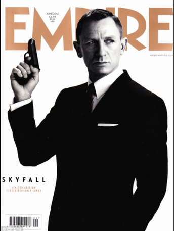
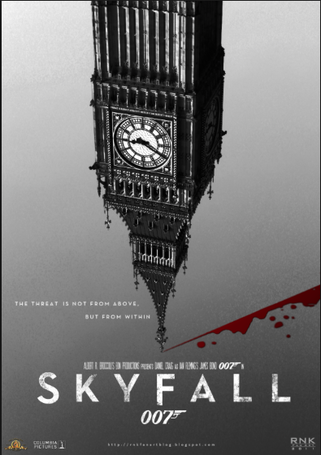
This is the magazine cover and the movie poster for SkyFall. The magazine cover and the movie poster are very different to one another, this is easily shown by the images on both, the man and the Big Ben. These images are completely different, yet they both portray the film accurately. However different they are the magazine cover and movie poster also have some similarities, such as the colour scheme, which is grey, white, toned down colours. The black and white make the main character stand out on the movie poster as he is in black and white and stands out well from the background. The title is in a gold colour which stands out behind the character. The clock on the movie poster is also in black and white and stands out against the grey background. The white text on the movie poster also stand sour clearly agains the grey background.
|
|
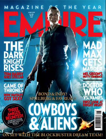
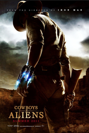
This is the magazine cover and movie poster for Cowboys & Aliens. The main character in both of the pictures look different due to the position they are standing in, the magazine cover is showing the character and his importance to the film and the poster is showing the background and the wrist accessory which shows their importance in the film. The magazine cover is not very effective due Daniel Craig being on the cover, this is due to him being the iconic figure for the James Bond films, this made us mistake him for promoting the James Bond film. The colour scheme is completely different as the magazine cover is bright and blue signifying that there was some action that has just passed whereas the movie poster is dark and shows the desert area in which the film is set in. The title of the magazine cover has no special effects, this draws attention to the main character who is stood in front of it, this shows us his importance in the film. The magazine cover has lots of text surrounding it, this shows the reader all of the different stories available but still doesn't take the importance away from the main character, this is different to the movie poster which has minimal text making the character the main object available to look at. The movie poster also clearly states that the director of Iron Man directed this film, this entices people who like Iron Man to watch this film due to the creative director's skills.
|
|
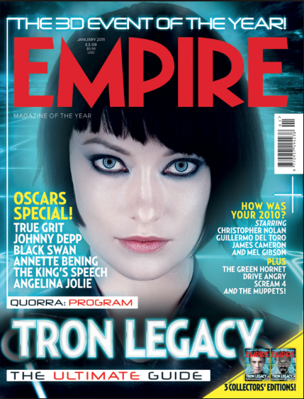
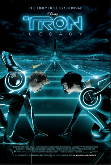
This is the magazine cover and movie poster for Tron Legacy. Both types of media are similar due tot he colour scheme, they both have a blue and black background. This is effective on the magazine cover because it highlights the woman's presence in the picture and it also makes the title seem clearer. In the movie poster, the blue and black makes the film look futuristic and creative, this is used well in the title of the film which represents the background and the effect it gives the audience. The character is placed behind the title which is unusual compared to the other covers that we have analysed, it shows us that the magazine is taking itself into account and making sure that the red stands out amongst the blue and the black as well as the characters face. The main character is presented on her own on the magazine cover, this signifies how important she is to the film compared to the duo that is presented to us on the movie poster, this shows us that they depend on each other in the film. There is a lot of text on the magazine cover to show off the different columns available, this is different to the movie poster which, again, has minimal text to draw the attention the the characters and the futuristic element to the film.
Molly, Dan
