Horror Movie Posters Analysis
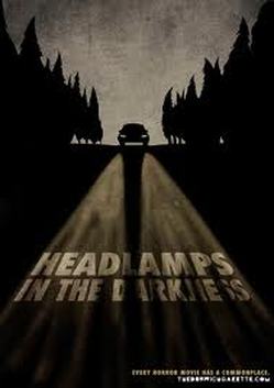
This poster is effective as the headlights of the car light up the title which is 'Headlamps in the Darkness'. The rest of the poster is mainly dark colours, this emphasises the title of the film. The trees in the poster imply that the setting is in a forest which is usually dark and not very well lit in the evenings. These dark colours and the implications of a forest make the title seem more realistic to the film itself, this is good because both the poster and the title inform the audience that the film is going to be about someone travelling in a car at night and there is no one else around.
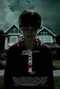
This poster is effective because the background of the poster is slightly lit up indicating that the film will be set in the house, and the boy is in darkness, this suggests to the audience that the boy is going to be the main character and the villain in this film, his lit up eyes also suggest that he is possessed, this is also suggested by the way that he is looking straight at the camera. The title has hi-lighted areas such as the 'si' which highlights the word inside Insidious also suggesting that the mayhem happens inside the house, the fact that the title goes through the boy's body also suggests that whatever happens goes through him too.
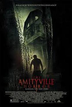
This poster is effective because you cannot see the character who is presented as a shadow, this creates mystery as you cannot tell who he is and many audiences like to find out who the main villain is. Like most posters, this poster is mostly dark colours like black and dirty yellow. The black sides of the poster, creating a narrow trench, this is daunting as most trenches are related to bad things, when looking through the trench you can see a house and the shadow of a man, both are not well lit so this creates both mystery and fear.
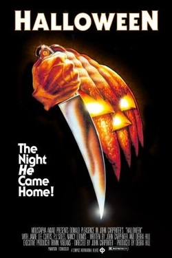
This poster is effective due to its simplicity. The title is very simple and stands out amongst the rest of the poster, the name Halloween is supported by the half of the pumpkin, as it is symbolic to Halloween. The Pumpkin is holding a knife which is ironic due to the tradition of carving a pumpkin with a knife during this season, whereas in this picture the pumpkin is holding the knife which can be unsettling to an audience as the pumpkin is getting revenge. this poster also has a slogan which makes you want to know more as it talks about the figure coming home, leaving you wanting to know why.
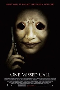
This poster is effective because the poster is unusual compared to others, there is a person with what looks like a mask on, this mask has eyes which also shows 2 mouths screaming, this shows us instantly that this character is the bad guy and they are going to kill people. The slogan is in red which represents the colour of blood so that the audience automatically knows that this film is a Slasher, the dark red also hides the slogan and makes it harder to see suggesting that the character is hidden throughout some of the film. The title is slightly faded and is bright, the colour makes it stand out and the fded effect on it shows mystery in the film, this is useful as you can tell that the film will have mystery in it due to the villain using a phone to call their victims.
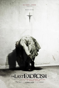
This poster is effective because unlike other horror movie posters, this one has a off-white background which stands out and is quite eye catching and the colour white represents purity which suggests that the innocent victim is going to be a young female. However, you can still tell that it is going to be a horror as it is in black and white. You can tell by looking at this poster that the little girl has been possessed or that their is something unnatural about her as she is bending a way she shouldn't and she is covered in blood and looks dirty. This is effective because you can tell the genre of the film just by looking at the poster which is helpful to the audience. The title of the fim is written in black and it is quite bold which stands out against the grey behind it. Some of the small print is written in red which represets blood and fear etc which links in with the film itself. The slogan 'Believe In Him' gives the audience a bit of knowledge about what the film is going to be about and it suggests that the film will be about a girl who gets possessed by a male demon.
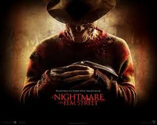
This poster is effective because the colours stand out however they still look scary as the reds and deep orange colours still make it look scary. The man in the middle of the poster looks effective because you can tell that he is the killer as he has a weapon in his hand and his fingers look abnormal. You cannot see all of his face which makes the audience curious about who he is and his face also looks abnormal and messed up and his clothes are ripped. There is something about the unknown which scares us. His smirk is also effective in this poster because you can tell that he is evil and that the film will be a physiological horror as this man looks like a human and is not a demon or a paranormal spirit. The title stands out as it is written in red which represents fear and it is in capitals which also catches your eye. The slogan reads 'Welcome To Your New Nightmare' which is effective to the audience because they can tell by this that the film will be about a killer who potentially murders people in their sleep. This lets the audience know a bit about what the film is going to be about so they know whether it will appeal to them or not.
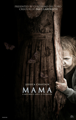
This poster is effective because you feel sorry for the little girl as she looks innocent and scared but then you also feel scared as she may be evil or possessed. The curtain she is holding is a very dark colour and it looks old and dirty which suggests that the little girl has been there for a while, possibly without any parents. The title of the film on this poster looks effective because the white colour stands out against the brown behind it and it slightly looks like its glowing which catches the audiences eye. The title links in with the poster because maybe the mother was possessed or died which is why the litte girl looks so sad and the curtain looks so old and dirty. This scares the audience because a mother is someone we can rely on and trust, so without them being there, or them turning into a demon scares us. The slogan 'A Mothers Love Is Forever' is effective because it links in with the poster and it gives us an idea about what the film is going to be about. The dark colour of this poster is effective because the darkness scares us because we do not know that is in the unknown and we do not really wish to know.
Molly, Dan
